character
the symbol representing individual letters, numbers, punctuation, etc. used in setting type - note: A and a are two different characters
the symbol representing individual letters, numbers, punctuation, etc. used in setting type - note: A and a are two different characters
the specific shape and design representing a character - above: a collection of glyphs representing the character a
capital letters
small non-capital letters
size of type is measured in points - 72 points is equal to 1 inch
the imaginary line that type sits on
an imaginary line that sits on top of the lowercase letters
an imaginary line that sits on top of the uppercase letters
the portion of a lowercase letter that extends past the meanline, such as b, d, and h
the portion of a lowercase letter that extends below the baseline, such as p, q, and y
the distance from the baseline to the meanline
the distance from the baseline to the capline
the space between baselines of type
moving the baseline of one or multiple characters up or down
the space between two individual letters
the space between a selection of letters
aligning type to the left (FLRR - flush left ragged right)
aligning type to the right (FRRL - flush right ragged left)
aligning text to a center point giving each line equal space on the left and right sides
aligning type to both the left and the right (letter or word spacing is adjusted to create this alignment) - the last line is typically flush left, but can be centered, right or justified
a character that is set above the baseline which is typically smaller than the other characters
a character that is set below the baseline which is typically smaller than the other characters

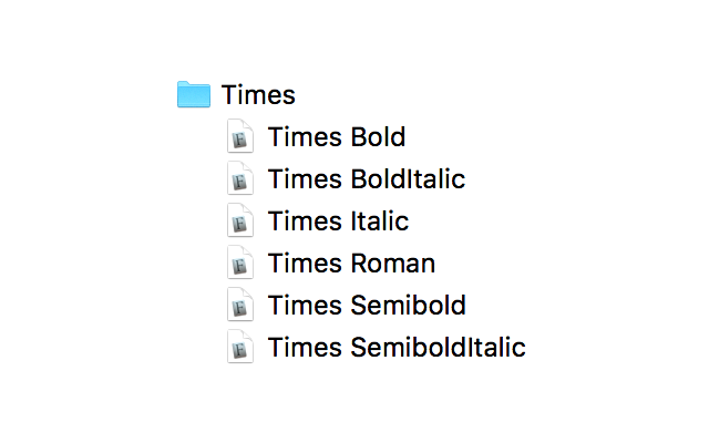
a digital file containing the complete collection of characters in a specific typeface - above: six fonts in the Times family
the design of the characters contained within a font - for example: Times or Helvetica
a modified version of the typeface, such as Roman, Italic, Bold, Bold Italic, Condensed, and Extended
all the typestyles available in one typeface - this Times family consists of Times Roman, Times Italic, Times Semibold, Times Semibold Italic, Times Bold, and Times Bold Italic
In an effort to keep some kind of order to the countless typefaces available, a classification system has been defined. Each category has its own unique characteristics which are typically based on three attributes:
the angle at which thin strokes on opposite sides of a character’s form connect to each other
stroke relationships - the level of contrast between the strokes that make up a character
the slant of the serifs
While there is still debate regarding the amount of categories, and in an attempt to be thorough yet brief, nine categories are presented below that are usually agreed upon.
Type anatomy describes the graphic elements that make up letters in a typeface.
the opening at the end of an open counter
a point at the top of a character where two strokes meet
a horizontal or upward sloping stroke that does not connect to a stroke or stem on one or both sides
an imaginary line from top to bottom bisecting the upper and lower strokes
a circular form at the end of the arm of a letter
the decorative stroke at the end of the arm of a letter, similar to a serif but more pronounced
the fully closed, rounded part of a letter
the decorative stroke at the end of the arm of a letter, similar to a serif but more pronounced
the open space in a fully closed part of a letter
the horizontal stroke of letters (also called bar)
a horizontal stroke that intersects the stem of a lowercase t or f
the inside angle where two strokes meet
a mark added to a letter to specify a specific accent or pronunciation
an angled stroke
a small round mark, such as the diacritic on a lowercase i or j (also known as a tittle)
a small stroke extending from the upper-right side of the bowl of the lowercase g (also can appear in a lowercase r)
the enclosed space in a lowercase e
a tapered or curved end of a letter
the horizontal stroke present on the number 5
the part of a stem that rests on the baseline
the thin stroke typically of a serif typeface
a curved stroke typical in a lowercase f
the short, decending portion of a letter
two or more letters joined together to form one character
a stroke that connects the bowl and loop of a lowercase g
a rounded projecting stoke
the enclosed (or partially enclosed) counter below the baseline of a double-story g
the space within a character that is open on one end
when a round or pointed letter extends higher or lower than a flat letter to make it appear the same size visually
a stroke added as a stop to the beginnings and ends of the main strokes of a character
the curved stroke aiming downward from a stem
the main curved stroke of the letter S
a small projection off a main stroke
the primary vertical stroke
the main straight or curved diagonal line
a decending stroke which is usually decorative
the teardropped ends of strokes
the end of a stroke that does not include a serif
a downward point where two strokes meet